Rockwell is at its core, simple geometry. It is almost entirely composed of circles, straight lines and right angles. Because it is so straight and angular it is can be very mechanical, but it also feels friendly and warm. Rockwell is a wonderful example of how some Slab Serifs have an inviting warmth even when they should feel cold and rigid. In addition to this, Rockwell can also be very playful which is an interesting characteristic that is fairly commons with geometric typefaces. So how is it possible that a typeface can feel scientific yet playful, retro yet contemporary and sharp yet warm? Welcome to the magic of Rockwell.
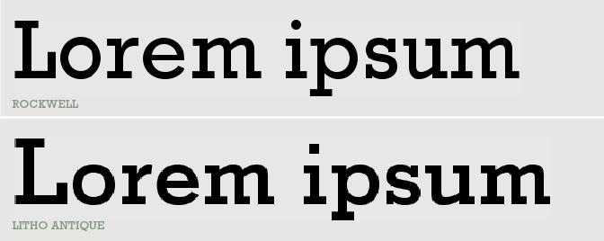
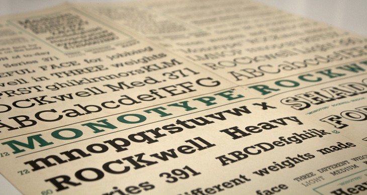
As you dive deeper into the history of type design, as with all forms of art, you will find that the great typefaces often stand on the shoulders of those before them. Rockwell is no exception. An updated drawing of 1910’s Litho Antique, Rockwell was released in 1934 for the Monotype Foundry. It sits slightly more condensed (more slender in individual letter width) and taller in the lowercase letters (called x-height) than its predecessor but it did inherit Litho Antique’s even stroke weight and perfectly squared serifs. Its great success appears to have been partly due to a right place at the right time situation as the Godfather of geometric typefaces, Paul Renner’s Futura, was released just a few years prior in 1927 and shortly after took its place as one of the most widely used geometric sans-serif typefaces (more on Futura coming soon). From here Rockwell took an alternate path than its Slab Serif grandfather Clarendon. Rockwell became a mainstay in the next few decades with its wide use in the era of Modernism and was often associated with the architecture and design of the Modernist movement.
Today, Rockwell and its contemporaries continue to see wide use but in-spite of their age, do not yet to evoke the deeper feelings of nostalgia often associated with the Clarendon style Slab Serifs. We see them widely used in surf and skate culture, home decor and cooking but most prominently in our contemporary web culture.

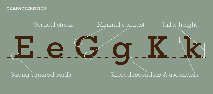
As mentioned earlier, Rockwell is a Geometric Slab Serif. It is constructed almost entirely of straight lines, perfect circles and sharp angles. It’s tall x-height and even stroke width helps to provide its strong presence with a somewhat blocky feel. It is in part due to this blocky nature Rockwell tends to me most effective when used as a headline font rather than used in body copy. While many contemporary versions have addressed this shortcoming, the original Rockwell still does not read well when used as a body font.

Rockwell lives many lives and can thrive in many climates. Malibu Rum uses it and it feels beachy and relaxed. Marshall amplifiers use it to transport you to rocking-out at a concert. Rockwell is usually the coolest person at the party. It is strong and laid back, gets along with everyone and thrives in almost every situation it is placed in. In its essence, Rockwell rocks!

By having a little information behind who it is, where it came from and how its used, you can hopefully choose a typeface that better reflects what you want to express.
Many type foundries carry their own variations of Rockwell. Listed here are some wonderful typefaces inspired by Rockwell and the other geometric slab serifs:
